Brand and website design for a mushroom grocer: mascot, wordmark, and a landing page built around the line "for mushroom lovers, by mushroom lovers."
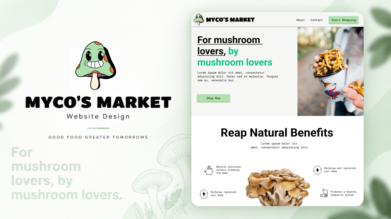
Myco's Market is a concept for a mushroom grocer, with the tagline "good food, greater tomorrows." The design covers the brand and the storefront's landing page together.
The brand is a smiling mushroom mascot and a chunky wordmark in a soft green palette. The landing page opens on the hero line "For mushroom lovers, by mushroom lovers" with photography and a shop call to action, then a benefits section pairing line icons with short claims around a hero product shot.
The write-up below walks through the mascot sketches, the light and dark themes, and the best-sellers and FAQ sections.
Case study
01Intro: shroom shroom, to the races!
I have a friend who wants to get a small mushroom business off the ground. Every time he comes over, he brings a container filled with mushrooms and sets it outside. "I've got to make sure these grow correctly in the right conditions." Depending on how you look at it, the man is passionate or obsessed. I, on the other hand, was filled with second-hand passion, so I offered to make him a website and design to help him brand and evolve his store. And just like that, we were off to the races!
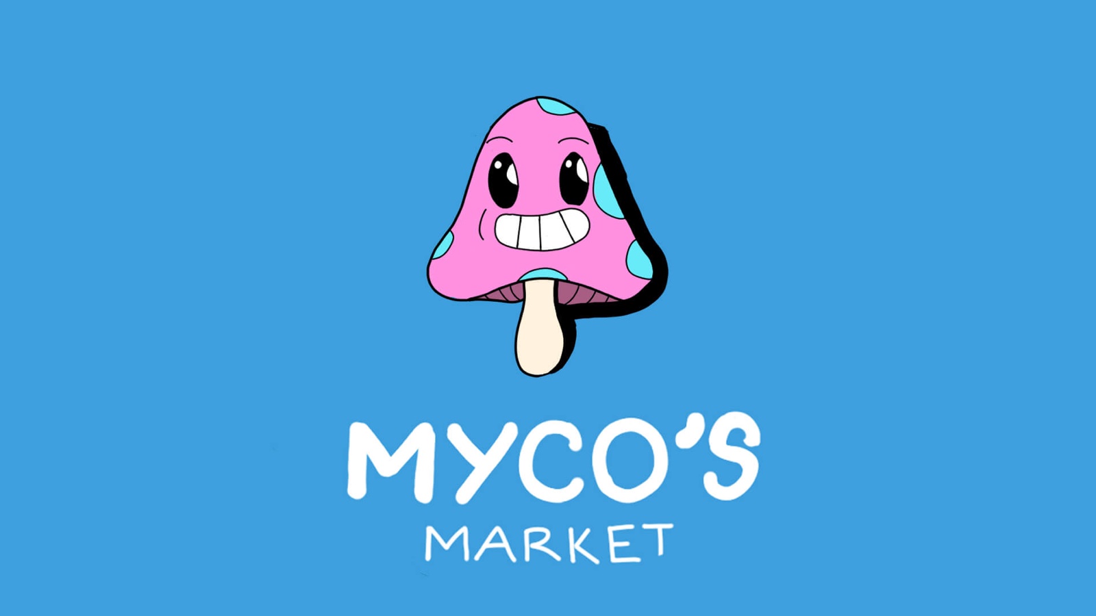
The finished mascot and wordmark
02He's a fungi
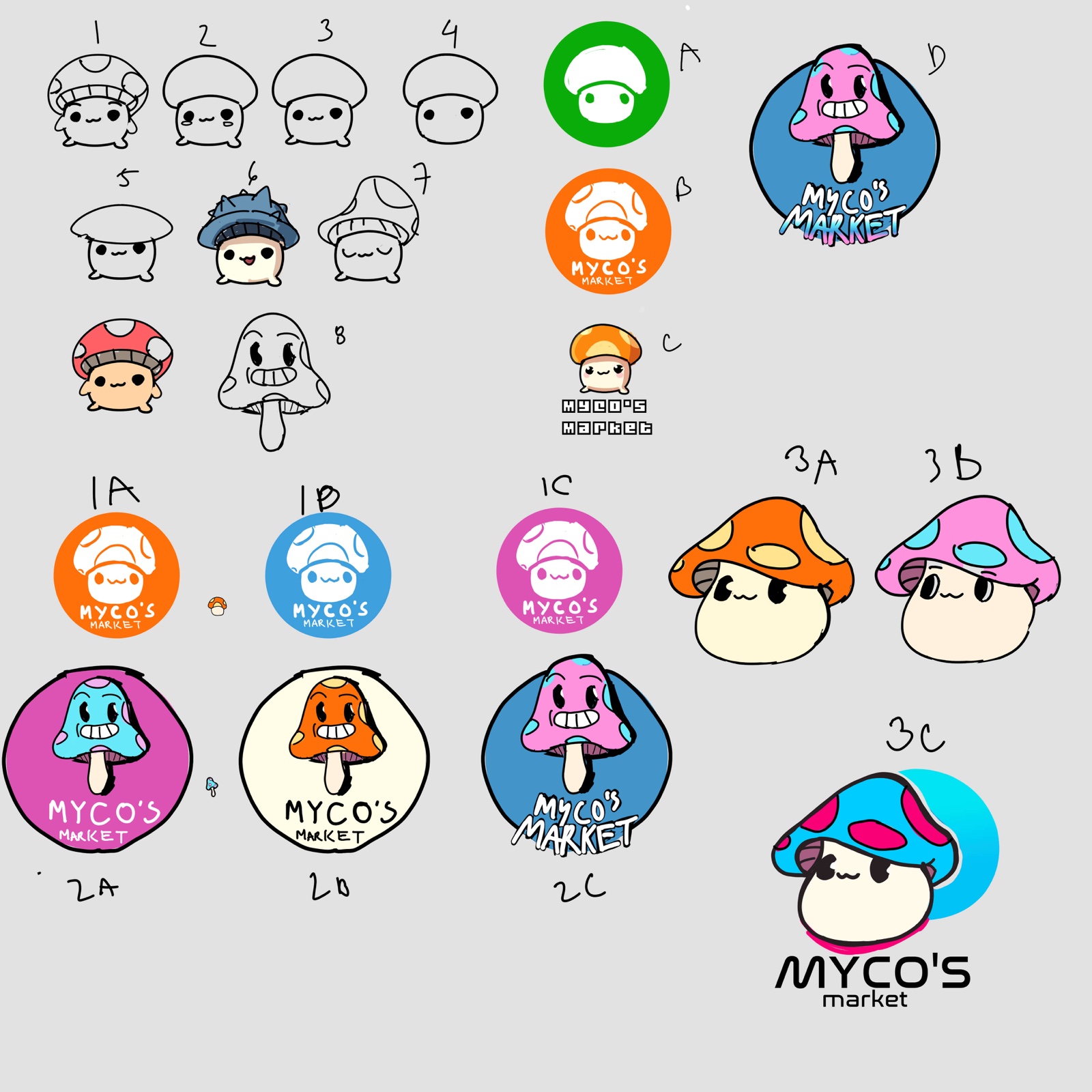
My friend wanted to start with something simple: a mascot logo that doubles as a sticker he could ship with his mushrooms to increase brand awareness. Since mushrooms are not the prettiest flower on the block, my approach was to make the mascot look cute and approachable. You can see my design sketches below.
Sketch process of the Myco's mushroom mascot
I couldn't decide between two color schemes: green and orange, which represent nature and energy, or blue, pink, and purple, which represent calmness and approachability. My friend really liked the contrast of the pink and the blue, as it made the mascot pop more.
03Mush-room for design
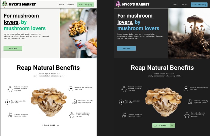
To be perfectly honest, I was working on the website design and the logo at the same time, so featured below is a light and a dark theme of the website. (You can probably guess which one we went with.) Because it was a landing page, I put a lot of importance on making mushrooms seem beneficial, healthy, and nothing to be scared of. For the first section after the hero, I wanted a close-up of a mushroom with its many benefits listed out. Looking at it that closely appeals to the user's sense of sight and makes them feel "hey, mushrooms aren't so bad, and look at all these benefits!" That is what leads them to learn more.
I lean toward lighter designs, but we went with the dark theme
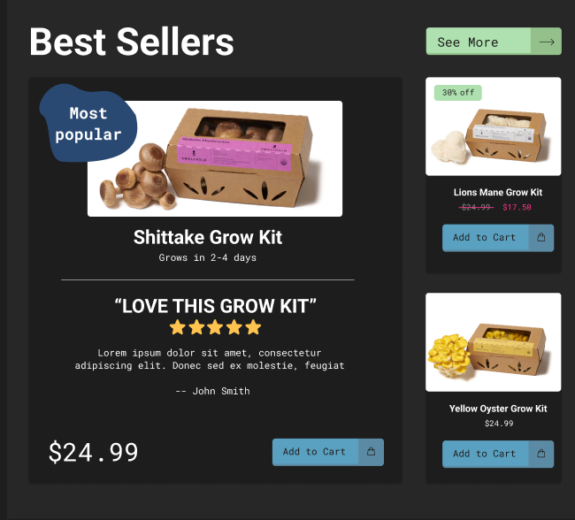
My friend does have an eye for growing mushrooms, and he makes it seem like it's really hard to grow them. Part of his business model includes grow kits that are fairly priced, so that beginners can get into it and so he doesn't have to grow everything himself. Talk about a win-win situation. I think it's important that the best-sellers section, or somewhere nearby, includes these introductory kits as something beginners can start with.
04Best in the mushroom kingdom
Showcasing mushroom grow kits
05Oy, ster's more?
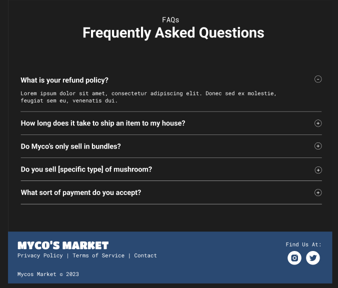
Finally, we have the frequently asked questions section. Sometimes doing research is not enough, and a place for FAQs to be answered is also a great way for beginners to see what to watch out for. In short, the theme for this landing page is to get people to feel more interested in the mushroom kingdom.